
Table of contents
The ideal living room requires a careful balancing of colours, furniture, and design. While choosing the perfect hues can improve the atmosphere, some hues might not be as appropriate as others. In order to create a unified and aesthetically pleasing area, we’ll look at the colours you should steer clear of in your living room in this post. Read on to learn What colors to avoid in living room if you want to turn your living room into a haven of comfort and style.
Ultra-Bright or Neon Colours
Bright neon colours may be in style, but they should not take over your living space. Instead, use them as accent pieces. These vibrant hues can easily overpower the senses, making it difficult to unwind or comfortably host company. To add sparks of excitement without creating visual mayhem, choose softer shades or use neon colours sparingly in pillows, artwork, or other decorative pieces.

Heavily subdued tones
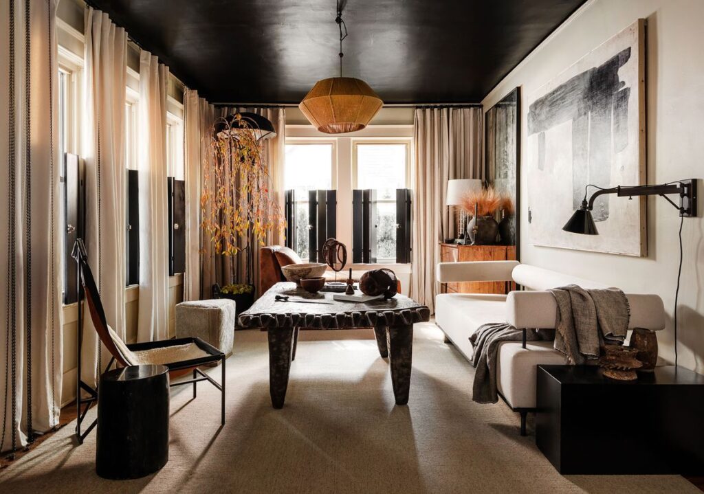
While employing deep, dark hues like charcoal grey or chocolate brown excessively in a small or dimly lit living room might give the space a cave-like feel, they can also lend a sense of refinement. These hues absorb light, giving the room a darker and smaller appearance. If you’re inclined to darker colours, think about utilising them as highlights or combining them with lighter colours to keep the space feeling harmonious and welcoming.
Contrasting colour schemes
Visual discomfort can result from the use of colours that clash or have an excessive amount of contrast. For instance, combining red and green in your living room may make you think of the holidays, but it can be eye-straining if done frequently. Instead, use comparable colours that are close to each other on the colour wheel or complementary colour schemes. These mixtures produce a more aesthetically pleasant and unified visual experience.
Stark White
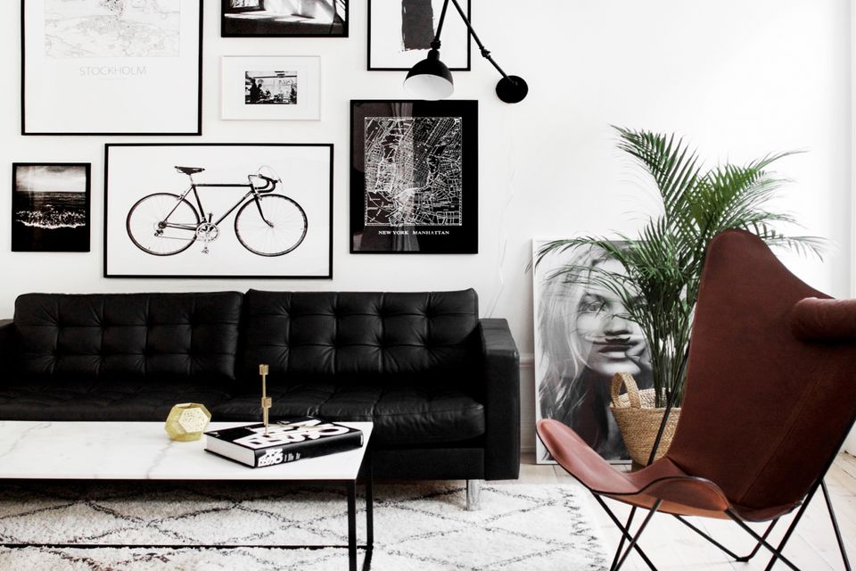
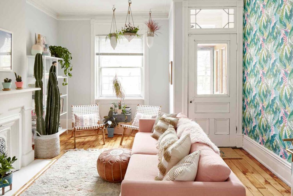
While using too much stark white in a living room may appear sterile and chilly, white may also convey a sense of cleanliness and space. White is also prone to exposing dirt and stains, which can be problematic in a room with a lot of foot activity like the living room. Instead of painting the walls white, think about utilising warm, off-white hues or incorporating white through furniture and other decor.

Distasteful Monochromes
In monochromatic colour schemes, many tones of the same colour are used. While this strategy may be effective in some situations, an all-monochrome living room may lack visual interest and seem boring. To avoid this, use furnishings, textiles, and accessories to give depth by introducing complementing colours or contrasting tones.
Overuse of the colour red
Red is a strong and vibrant colour, but it should be used with prudence in your living room. An environment that is too red may be agitated and restless, which is not favourable to relaxation. If you want to add vibrancy to the room without overpowering it, think about using red as an accent colour rather than painting all of your walls red or using it heavily in your furnishings.

Overuse of cool tones
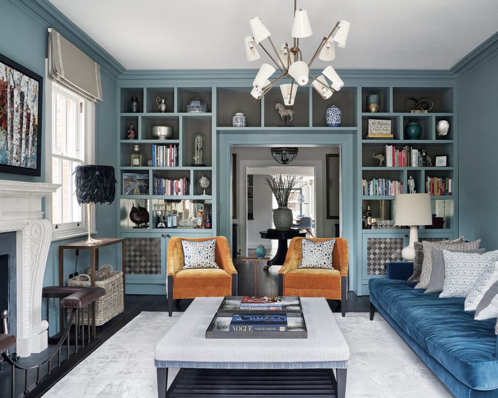
Although employing blues and greens in excess might make the living room feel cold and distant, they can also generate a sense of peace. Balance cool hues with warm accents like hardwood furniture, earthy design, or warm-toned textiles to counterbalance this. Both residents and visitors will enjoy the cosier and friendlier atmosphere that this balance will produce.
Uneven Brightness
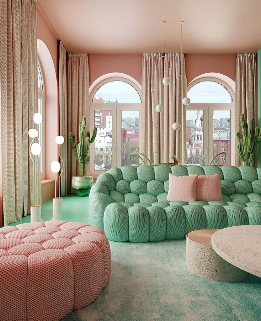
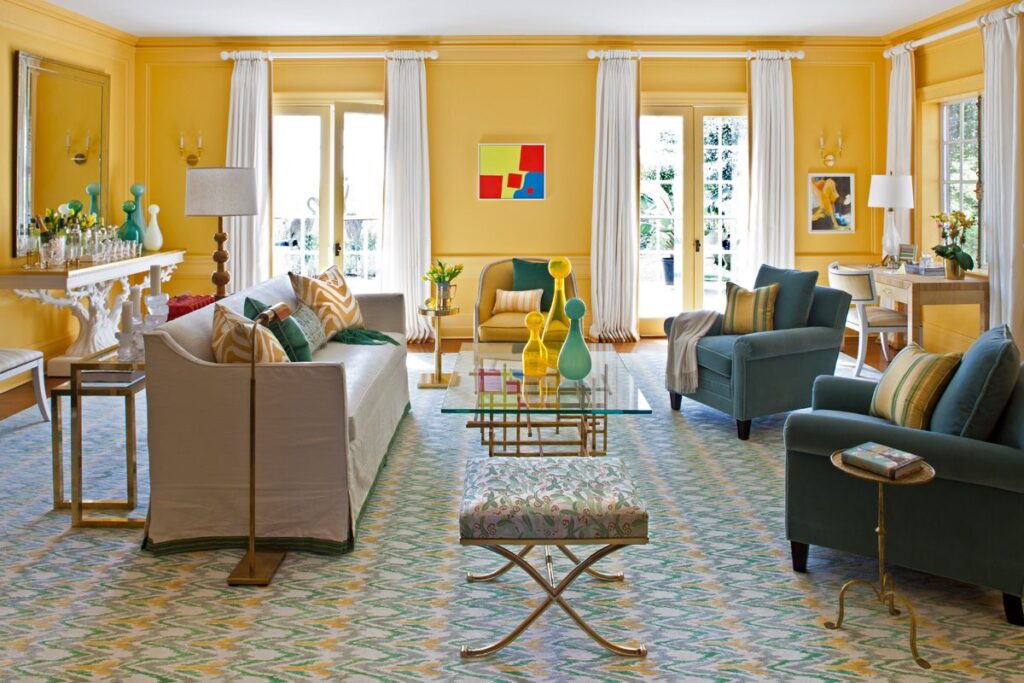
While vivid and striking colours have a role in interior design, utilising them excessively might cause sensory overwhelm. For instance, a space painted in vivid shades of red, orange, and yellow can evoke images of a circus. Instead, to establish focal points and preserve visual equilibrium, use bright colours sparingly and in combination with neutral tones.
Fashionable but Transient Colours
While it may be tempting to decorate your living room in accordance with the newest colour trends, remember that fads come and go. If you choose too many current colours, your room could look antiquated before you’d like. If you’re drawn to a certain trending colour, think about incorporating it subtly into the room’s decor, furnishings, or artwork rather than making it the focal point.
Disregarding the Lighting Situation
The lighting is an important aspect to take into account while selecting colours for the living room. The appearance of colours in a place can be dramatically affected by both natural and artificial lighting. Consider how various colours seem in various lighting situations before making your colour decisions. In artificial illumination, what appears warm and inviting in daylight may feel chilly and unwelcoming. Test samples and keep an eye on them throughout the day to make sure the colours you’ve chosen are still pleasing under all kinds of lighting.
Conclusion
The centre of your house is your living room, a place where convenience and beauty coexist. It’s crucial to create a balance between practicality and personal taste when choosing colours. A more hospitable and aesthetically pleasing living room can be achieved by avoiding overpowering bright hues, excessively dark tones, clashing colour combinations, glaring white domination, and unvarying monochromes. Keep in mind that the idea is to design a location where you and your visitors can relax and take in the surroundings. For additional inspiration and guidance on creating the ideal colour scheme for your ideal living room, go visit Arteriorz.co.uk.
FAQ’S
Warm beige and soft grey, rich navy and cream, earthy greens and warm browns, and other combinations can make your living area feel cosy and welcoming. These combinations strike a mix between practicality and aesthetic appeal.
In a tiny living room, you can use dark colours, but you should be careful with the quantity and location. When coupled with lighter hues, a dark colour on a feature wall or as an accent can provide depth without making the space feel too cramped.
Bright colour accents, such as throw cushions, artwork, or decorative items, can give a space energy without overpowering it. To establish balance and focal points, deliberately use these elements.
“What colors to avoid in a living room? To prevent a jarring look, steer clear of overly bright or clashing colors. Opt for harmonious, calming shades.”